
DESIGN STUDY: JOSEF ALBERS & COLOR RELATIVITY
I'm always thinking about shapes. In jewelry design, most shapes I work with are flat, but even with clothing, how something looks basically comes down to how it is shaped. The next part is what material the shape is made of, and then comes color.
As I begin to finalize my Fall 16 collection, I thought I'd look at the work of Josef Albers, a prolific artist who worked with a variety of mediums at the school of Bauhaus. What I love about Bauhaus in general is that their work was so well-rounded. The students studied color, crafts, textiles, performance, design... the list goes on. And since I work with so many types of materials, I study Bauhaus artists and their theories regularly.
Bauhaus School Curriculum
Bauhaus artist Josef Albers was born in Germany in 1888. His career began as a stained glass artist, though his work is very distinct in comparison to standard stained glass works. Most stained glass is either traditional (think churches), or crafty (think the 60s). But Albers' work encompasses shape, material and color: the most essential elements of design, in my book.


After studying at the Bauhuas School under Johannes Itten, the color theory master of Bauhaus, Albers became a teacher in color theory at the Bauhaus school himself. With Bauhaus, color theory was a main course in their curriculum, and all of their work in color theory is still used today.
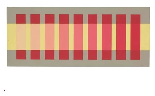
Through the exploration of color, Albers developed a theory that color is seen relative to its surroundings. In various studies that he called Exercises of Color, Albers took solid colored papers, cut them into shapes, and placed them next to, and on top of other colors to demonstrate. What resulted from the same color strip being placed next to, or on top of two other colors, was that the 'same color' appeared as two different shades. This phenomenon is what Albers referred to as Color Relativity.
The small rectangles on the left are the 'same color' but appear as two different shades given their interaction with the neighboring colors. The concentric lines on the right are also the 'same color' but appear to be different shades because of their interaction with the surrounding colors.
These exercises, according to Albers, demonstrate that color is absolute, but that it interacts with other colors, and is thus experienced differently, depending on which colors are interacting with one another.
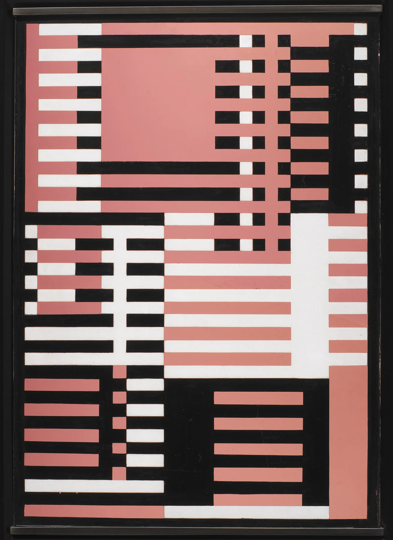
With this as a foundation, Albers furthered his inquiry by playing with transparency of colors. In this work, Albers showed that with color, what appears to be a form of transparency, is actually a new color all together. What appears to be the transparent part(s) are in fact another color with various levels of the neighboring colors combined.


Much of what Albers did with his Exercises of Color shaped color theory, which continues to govern the worlds of design and art today. Though Albers developed his theories on color in the late 1920s through the 1930s, it wasn't until 1963 that he published his book, Interaction of Color, through Yale University Press, finally canonizing his ideas for the art world at large.
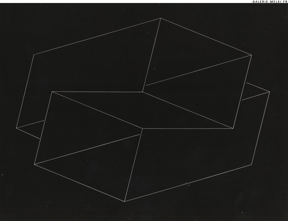
Applying the simplicity of his findings to his own work, beginning in the mid 1920s, Albers began a series of untitled works that continued throughout his life, resulting in geometric, mostly line based art, using very few colors.


Because Bauhaus focused on interdisciplinary arts, they encouraged the exploration of various mediums. So during his tenure as instructor at Bauhaus, Albers also was the head of the carpentry department. Applying Bauhaus' principle that form follows function, and combining that with his understanding of shape and color, Albers designed furniture that continues to be sought after today.


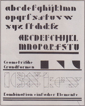
Albers also taught a course at Bauhaus on drawing and lettering where he developed a set of fonts.

But sadly, during WWII, Bauhaus dispersed. In 1933 Albers came to the US with his wife, Anni Albers, a Bauhaus trained textile designer and former student of Albers.
In the US, Albers spent his first two decades teaching at Black Mountain College in North Carolina, before taking the head of design position at Yale in 1950.
While at Yale, Albers began a series of work called Structural Constellations, where he combined his understanding of color and line, while placing very strict parameters on himself to produce "the maximum affect through minimum means." During this time, and up through the 1960s, Albers created a series called, An Homage to Squares, applying similar principles as the Structural Constellations, but adding the element of color.


After retiring from Yale in 1958, Albers was given a grant to do exhibitions and lectures on his work. Through the Museum of Modern Art in New York, a global tour of his work was shown between the years of 1965 - 1967. Finally, in 1976, four years before his death at the age of 88, Albers was the first living artist to have a solo show at the Metropolitan Museum of Art in New York.
Having lived such a prolific life as an artist, Albers continues to influence design from furniture to type faces, and from color, to line and form today. Though many people seem to be referencing his work in their own contemporarily (especially in fashion), I'm not sure that they are directly aware of its origins. But what makes Albers such an effective artist beyond his impressive ability to work with such a wide array of media, is that his work is so distinctly minimal, that it has become part of the fabric of our collective subconscious.
Today his legacy lives on in the form of an app put out by Yale called, Interaction of Color by Josef Albers. Yes, that's right, a dude born in 1888 has an app... With this app, one can learn Albers' theories on color while creating study 'sketches' (if you can call a digital thing a sketch). By putting shapes together and applying color, a basic geometric design is made. Each color used in the artwork is broken out for reference at the bottom of the image, so they can then be translated to CMYK, RGB, HEX, Pantone, etc. I actually recommend using the app for anyone interested in color theory, or for anyone who'd like a tool for creating cohesive color stories for their designs.
Pretty cool, especially since these ideas were first developed over 100 years ago.
Courtney Bagtazo © Bagtazo, 2015